Showing posts with label Machine Learning. Show all posts

Friday, September 1, 2023

Machine Learning - Build and Compare Regression Models


This is a continued blog following Build And Compare Classification Models. We are going to build and compare a bunch of regression models in this post.

As for the program, we use the same mechanism. A factory class named RegressorFactory takes on tasks such as instantiating a model and fitting the model and predicting and evaluating the model.

Function CompareRegressionModels() takes the responsibility of implementing the work flow.

Along with the score (Coefficient of determination) provided by a model itself, root mean squared error (RMSE) is another indicator chosen to evaluate the models. You can find them on the comparison graph. 

A solid circle represents a model on the chart. The score is displayed near the circle. The RMSEs of the training data and the test data stand for X, Y axis, respectively.


make_regression Dataset


Another example for California Housing dataset.


California Housing


Models to Be Compared

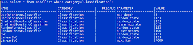
The regression models are also administered in the table ModelList with Category set to Regression, as shown on the screenshot below.

PreCalc indicator is set to 1 if the model requires polynomial calculation, otherwise set to NULL.

The pair of Parameter and Value define the parameters passed to the model in its creation. The table structure allows you to add up to unlimited parameters. What if we specified a duplicate parameter? The first one will be picked out and passed to the model. 


Dataset

Dataset should be loaded into table DatasetReg. Please make sure you only add the feature columns and the label column to the table and place the label column in the last. 

The sample is a dataset generated by make_regression() method.


make_regression Dataset


Main Flow

The main flow is realized in function CompareRegressionModels(), shown in the diagram below. 

But one thing we need to pay attention to, some models such as Lasso, Polynomial and Ridge require transforming the input data with polynomial matrix before it is fed into the models. So, after standardize the input data, we call PolynomialFeatures() to prepare polynomial calculation matrix, then pass the standardized data to the calculation matrix and get the output. The output will be passed to that group of models. As a result, the flow becomes slightly different.


How to Add a Model?

In case you want to add more models, you can insert the corresponding records into the table ModelList using SQL scripts, or whatever database tool. And please make sure the new model has been included in class RegressorFactory. Otherwise, you will get a warning message saying the model is not implemented as of now.


insert into modellist values('Multiple', 'Regression', null, '', '');
insert into modellist values('Polynomial', 'Regression', 1, '', '');
insert into modellist values('Ridge', 'Regression', 1, 'alpha', '0.1');
insert into modellist values('Ridge', 'Regression', 1, 'random_state', '123');


The newly added models pop up on the graph.


make_regression Dataset


How to Switch the Dataset?

The program fetches data from table DatasetReg, so the data must be moved into DatasetReg. Here is an example for your reference.

- Create an external table named Dataset_Housing.

create table Dataset_Housing (
   MedInc number
  ,HouseAge number
  ,AveRooms number
  ,AveBedrms number
  ,Population number
  ,AveOccup number
  ,Latitude number
  ,Longitude number
  ,Price number
)
organization external
(
  type oracle_loader
  default directory externalfile
  access parameters
  (
    records delimited by newline
    nobadfile
    nologfile
    fields terminated by ','
  )
  location ('cal_housing.csv')
reject limit unlimited
;

- Drop table DatasetReg.

- Create table DatasetReg from Dataset_Housing.


Relook at Mountain Temperature Prediction

GradientBoostingRegressor is used for mountain temperature prediction in the blog Machine Learning - Build A GradientBoostingRegressor Model. In effect it overfit the training dataset. So we run all these regression models on the same dataset this time. 

As you can see from the evaluation graph, DecisionTreeRegressor and Polynomial and RandomForestRegressor and Ridge tend to be overfitting as well for this particular predictive case. 


Appendix: Source Code


CompareRegressionModels()

Machine Learning - Build and Compare Classification Models


When it comes to machine learning, there are a wide range of models available in the field. With no doubt, it will be a huge project in terms of efforts and time if someone tries to walk them through. So I've been thinking it may be a good idea if we get them work first with example Python codes. As to concept, underlying math, business scenarios, profits, concerns etc., we can pick up with more researches later when we work on a specific business case. The merit to do this is that we get to know, these models, probably just a little, and we can gain hands-on programming in the first place. It would lay a foundation for further development as needed. 

I happened to read a book, Python Statistics & Machine Learning Mastering Handbook, authored by Team Karupo. The book introduces a bunch of models with concise texts and examples covering supervised and unsupervised and deep learning estimators. 

Inspired by it, I planned to build a series of models at once that can be flexibly selected and visualize their performance on the same graph. Moreover, I would like to approach it from the engineering angle and make the process as simple as we feed the input dataset, then get the visual evaluation results, like the graph shown below. (Please be noted that the process of developing and tuning a model is not the subject we are going to address here. If you are interested in that, please check out Machine Learning - Build A GradientBoostingRegressor Model for more details. )


For each model, we'll do the prediction for both the test data and the training data, and calculate their  accuracy scores as well. Then display them on the chart where a model relates to a solid circle. X axis represents the accuracy score for the training data, whereas Y axis represents the accuracy score for the test data. 

At the same time, use the score() method provided by the model to get the score for this specific case,  texted right above the circle.


Models to Be Compared

Models to be compared are stored in the table ModelList, as shown below. 

Name field bears the name of a model. 

Category field defines which group the model belongs to, either Classification or Regression. 

Parameter and Value fields define parameters to be passed to the model in its creation. Parameter field holds the name of the parameter, and Value field carries the value associated with that parameter. You can add as many parameters as you need for a model. On the other hand, if you don't specify any parameters for a model, the model will take the default parameters.

PreCalc is an indicator showing if we need to carry out extra calculations on the input data before it is passed to a model. For example, we should use a polynomial to transform the data before feed it into Lasso regression model. We'll discuss it more in another blog Machine Learning - Build And Compare Regression Models.


Dataset

The dataset is kept in a table called DatasetCls, which consists of only the feature columns and the label column. Any descriptive columns have to be removed. Additionally, the label column has to appear last. DatasetCls can be either a normal table or an external table.

That is all, we don't have more rules for it. 


Dataset Generated by make_classification()


Main Flow

The main flow, illustrated on the following diagram, is implemented in  function CompareClassificationModels() that you can find in the latter section Appendix: Source Code.

Please be noted that we'll standardize the training data and the test data before feed them into the models.


Main Flow


How Are Models Created?

Model instantiation is implemented in class ClassifierFactory packaged in modelfactory.py. Please refer to Appendix: Source Code section.

The factory method newclassifier() creates and returns a model with specified parameters. The models defined inside the class are all the classifiers that this factory can produce so far. You can add or delete models based on your needs.

The method execute() will call fit() and predict() and score() on the model. Additionally, it will call  accuracy_score() to evaluate the model's performance on the given datasets.


How to Add a Model?

This is pretty straightforward. We can get it done by appending a record to the table ModelList. For example, we would like to add LogisticRegression to the list and specify random_state parameter at the same time. So we can execute the following SQL statement.

insert into modellist values('LogisticRegression', 'Classification', null, 'random_state', '123');


Then we re-run the program, as you can see, LogisticRegression appears on the graph. 


How to Switch the Dataset?

For example, we would like to use the wine dataset coming with sklearn. If we have the csv file on hand, we can create an external table using the SQL script below. If the script doesn't work in your environment, please double check if your csv file has the right encoding. 

create table datasetcls (
  fixed_acidity number,
  volatile_acidity number,
  citric_acid number,
  residual_sugar number,
  chlorides number,
  free_sulfur_dioxide number,
  total_sulfur_dioxide number,
  density number,
  pH number,
  sulphates number,
  alcohol number,
  quality number
)
organization external
(
  type oracle_loader
  default directory externalfile
  access parameters
  (
    records delimited by newline
    nobadfile
    nologfile
    fields terminated by ';'
  )
  location ('winequality-red.csv')
)
reject limit unlimited
;

Wine Dataset

We can do the same for Iris dataset.


Iris Dataset

For the dataset processing, we used the hard-coded parameters. Obviously there is more room for improvements. In response to needs in the field, surely we can add more customized functionalities.

Additionally, the similar work for the regression models will be undertaken and summarized in another blog. 


Reference

Python Statistics & Machine Learning Mastering Handbook  Team Karupo

Choosing the right estimator

Machine Learning - Build A GradientBoostingRegressor Model

Machine Learning - Build And Compare Regression Models


Appendix: Source Code


CompareClassificationModels()

Wednesday, August 2, 2023

Machine Learning - Build A GradientBoostingRegressor Model

This post is going to demonstrate the entire process of building a machine learning model. Model deployment will not be covered in this blog.


About Model Selection

Model selection is a critical part of building a machine learning model. In practice, the candidate models need to be tested with the sufficient data and be properly evaluated. In this post, the Gradient Boosting Regressor model is selected based on comparison on paper. As an ensemble model, it gives the best result produced by the specified number of underlying decision trees. And decision tree is an ideal model that we can use grid search to find the best hyperparameters. This model probably can efficiently and effectively achieve the expected result.

Supervised learning will be selected for this exercise.


Data Preprocessing

The original temperature data is scraped from a mountain hiking website. But the scraping process is not included in this blog. The temperature data along with the coordinates of the mountains is loaded into the predefined table in the database. We could say the data engineering part is almost done here.


Data Samples

Encoding processing is not required as there are no categorial features used by the model in the dataset. Other data transformation and data conversion are not in scope as well. Considering the model will accept the coordinates and altitude inputted by user to make a temperature prediction after deployed, we don’t standardize the features in this exercise. As a reference, I tried standardized features and discovered the model produces the same output as the non-standardized does.

No need to mention, A few cleansing tasks must be done before it is fed to the machine learning model. Mainly they are missing data handling and column extraction. After examined the data, we found nulls in the temperature columns which cannot be simply replaced with a zero or mean value. The rule is to exclude them from the dataset. Additionally, the dataset contains a part of features which will not be used by the model, so that part will also be removed. The features in need are Latitude, Longitude, and Altitude, and the target is Avg (average temperature). Avg instead of Max or Min is chosen because it reduces the effect of an extremely high or low temperature corresponding to a particular weather at some point. 

    #
    # drop null data
    df = dforg.dropna()
    print(df[df["Avg"].isna()])
    #
    # extract the features and the target
    X = df[["Latitude", "Longitude", "Altitude"]]
    y = df["Avg"]


Dataset Preparation

To do this, we simply borrow train_test_split from sklearn.model_selection, with the proportion of test data as well as random state specified. 

    #
    # divide the dataset into training dataset and test dataset
    X_train, X_test, y_train, y_test = train_test_split(X, y, test_size=0.3, random_state=123) 


Train the Model

After the data prepared, we create an instance of GradientBoostingRegressor, and then call its fit() member function to fit the model.

    #
    # create the model
    gbrd = GradientBoostingRegressor(random_state=123)
    #
    # train the model
    gbrd.fit(X_train, y_train)


Make a Prediction

We pass the test dataset to the fitted model and get the estimated temperatures in return. The predictions will be evaluated and visualized in later steps.

    #
    # make a prediction
    y_pred = gbrd.predict(X_test)


Model Evaluation

It's time to see how well the model performs now. The evaluation is carried out through comparing the score given by the model and root mean squared error (RMSE). The score computed by the model is in deed the same as the coefficient of determination (R2). Technically, the higher the score, the better the model. But we need to consider if the model is over-fitting at the same time. 

     #
    # evaluate the model
    scored = gbrd.score(X_test, y_test)
    #
    # save the predicted and actual temperatures
    tmp_pred = y_pred.reshape(np.size(y_pred), 1)
    tmp_test = y_test.values.reshape(np.size(y_test), 1)
    tempd = pd.DataFrame(np.hstack([tmp_test, tmp_pred]))
    rmsed_test = np.sqrt(mean_squared_error(y_test, y_pred))


Hyperparameter Optimization

A combination of Grid Search and Cross Validation is employed to search for the best parameters. The result may vary according to the parameter grid we pass to GridSearchCV. So, this optimization process is iterative until we can find the most practical ones. In this example, we first use the default parameters for the estimator, then give a try to the following parameters.

    parameters = {
        'n_estimators' : [3, 5, 10, 30, 50, 100],
        'max_features' : [1, 3, 5, 10],
        'random_state' : [123],
        'min_samples_split' : [3, 5, 10, 30, 50],
        'max_depth' : [3, 5, 10, 30, 50]
    }

As we can tell from the graph before and after optimization, the score goes up a little and the predicted values are more correlated with the actual ones. During the fitting, the random state is fixed as stated in the codes. An unfixed random state is also tested but it turned out that a fixed one has a better performance. 

best params: {'max_depth': 3, 'max_features': 3, 'min_samples_split': 3, 'n_estimators': 30, 'random_state': 123}


Visualization

A BI tool can be used for visualization. In data analysis, the estimated results in fact can be fed back into the BI tool in many ways, for example, the results are written into a database table where the tool will read the data, or the BI tool can integrate with the Python program through an engine. Here we use matplotlib to visualize the results. The embedded codes easily transform the data into a visual graph, costly effective.


Predicted vs Actual

    #
    # visualize the results
    plts.use('ggplot')
    fig, ax = plt.subplots()
    #
    # default parameters
    ax.scatter(tempd.iloc[:, 0], tempd.iloc[:, 1], color='darkblue', label='default')
    #
    # optimized parameters
    ax.scatter(tempb.iloc[:, 0], tempb.iloc[:, 1], marker='x', color='crimson', label='optimized')
    #
    # reference
    xtmp = np.array([np.min(tempd.iloc[:, 1]), np.max(tempd.iloc[:, 1])])
    ytmp = xtmp.copy()
    ax.plot(xtmp, ytmp, label='reference', color='gray')
    #
    # show scores and correlation rates
    strd = 'score: ' + str(scored) + '   rmse: ' + str(rmsed_test)
    strb = 'score: ' + str(scoreb) + '   rmse: ' + str(rmseb_test)
    ax.text(xtmp.min(), ytmp.max(), strd, color='darkblue')
    ax.text(xtmp.min(), ytmp.max()-1,strb, color='crimson')
    #
    # graphical setting
    ax.legend(loc='lower right')
    ax.set_xlabel('actual temperature')
    ax.set_ylabel('predicted temperature')
    fig.suptitle('mountain temperature prediction')

    plt.show()


Save the Model

The trained model with optimized hyperparameters assigned is saved as a binary file. The pickle library is perfectly suited to process this.

     with open('MountTempModel.pkl', mode='wb') as f:

        pickle.dump(gbrb, f)

To deploy the model, we can call pickle.load to instantiate it. We'll discuss it in another blog.


A Note

If we only look at the scores, the model seems to perform well for this particular case. The optimization finds a better estimator as we expected. Later, I used the model to get the predicted temperature for the training data, and calculated its RMSE as well. The RMSE is by far smaller than the test data's RMSE. We could came to a conclusion that the model is actually over-fitting.

I am thinking to come up with a post which will build and compare a series of selected models for a specified dataset. So how well they perform will be visualized on the same graph. Hopefully I could streamline the process as simple as that we feed the input dataset and then get the visual evaluation results for all those models. (Please refer to Machine Learning - Build And Compare Regression Models)


The complete Python program is attached below.

import pandas as pd
import numpy as np
import pickle
from datetime import datetime
import oracledb
from sklearn.model_selection import train_test_split
from sklearn.ensemble import GradientBoostingRegressor
from sklearn.model_selection import GridSearchCV
import matplotlib.pyplot as plt
import matplotlib.style as plts
from sklearn.preprocessing import StandardScaler
from sklearn.metrics import mean_squared_error

def PredictMountTemp():
    #
    # load the dataset from the database
    sqlstr = 'select * from mount_temp'
    columns = ['No', 'Mountain', 'Latitude', 'Longitude', 'Altitude', 'Max', 'Avg', 'Min', 'Prefecture']

    try:
        with oracledb.connect(user="test", password='1234', dsn="localhost/xepdb1") as conn:
            with conn.cursor() as cursor:
                dforg = pd.DataFrame(cursor.execute(sqlstr), columns=columns)
    except oracledb.Error as e:
        print(f'Failed to fetch data from the database ({str(e)})')
        return

    dforg = dforg.set_index('No')

    #
    # drop null data
    df = dforg.dropna()
    print(df[df["Avg"].isna()])

    #
    # extract the features and the target
    X = df[["Latitude", "Longitude", "Altitude"]]
    y = df["Avg"]

    print(pd.concat([X, y], axis=1))

    #
    # divide the dataset into training dataset and test dataset
    X_train, X_test, y_train, y_test = train_test_split(X, y, test_size=0.3, random_state=123)

    print(X_train.shape, X_test.shape, y_train.shape, y_test.shape)

    #
    # create the model
    gbrd = GradientBoostingRegressor(random_state=123)
    #
    # train the model
    gbrd.fit(X_train, y_train)
    #
    # make a prediction
    y_pred = gbrd.predict(X_test)
    #
    # evaluate the model
    scored = gbrd.score(X_test, y_test)
    #
    # save the predicted and actual temperatures
    tmp_pred = y_pred.reshape(np.size(y_pred), 1)
    tmp_test = y_test.values.reshape(np.size(y_test), 1)
    tempd = pd.DataFrame(np.hstack([tmp_test, tmp_pred]))
    rmsed_test = np.sqrt(mean_squared_error(y_test, y_pred))

    #
    # using Grid Search to find the best estimator
    starttime = datetime.now()
    print('Grid search, starting from: ', starttime.isoformat())

    parameters = {
        'n_estimators' : [3, 5, 10, 30, 50, 100],
        'max_features' : [1, 3, 5, 10],
        'random_state' : [123],
        'min_samples_split' : [3, 5, 10, 30, 50],
        'max_depth' : [3, 5, 10, 30, 50]
    }
    gbrb = GridSearchCV(estimator=GradientBoostingRegressor(), param_grid=parameters, cv=10)
    gbrb.fit(X_train, y_train)
    #
    # time consumed
    endtime = datetime.now()
    print('Grid search, ending at: ', endtime.isoformat())
    print('Time consumed for optimization: ', (endtime-starttime))
    #
    # best estimator
    print('Best params: {0}'.format(gbrb.best_params_))
    print('Best estimator: {0}'.format(gbrb.best_estimator_))

    y_pred = gbrb.predict(X_test)

    scoreb = gbrb.score(X_test, y_test)
    #
    # save the predicted and actual temperatures
    tmp_pred = y_pred.reshape(np.size(y_pred), 1)
    tmp_test = y_test.values.reshape(np.size(y_test), 1)
    tempb = pd.DataFrame(np.hstack([tmp_test, tmp_pred]))
    rmseb_test = np.sqrt(mean_squared_error(y_test, y_pred))

    #
    # visualize the results
    plts.use('ggplot')
    fig, ax = plt.subplots()
    #
    # default parameters
    ax.scatter(tempd.iloc[:, 0], tempd.iloc[:, 1], color='darkblue', label='default')
    #
    # optimized parameters
    ax.scatter(tempb.iloc[:, 0], tempb.iloc[:, 1], marker='x', color='crimson', label='optimized')
    #
    # reference
    xtmp = np.array([np.min(tempd.iloc[:, 1]), np.max(tempd.iloc[:, 1])])
    ytmp = xtmp.copy()
    ax.plot(xtmp, ytmp, label='reference', color='gray')
    #
    # show scores and correlation rates
    strd = 'score: ' + str(scored) + '   rmse: ' + str(rmsed_test)
    strb = 'score: ' + str(scoreb) + '   rmse: ' + str(rmseb_test)
    ax.text(xtmp.min(), ytmp.max(), strd, color='darkblue')
    ax.text(xtmp.min(), ytmp.max()-1,strb, color='crimson')
    #
    # graphical setting
    ax.legend(loc='lower right')
    ax.set_xlabel('actual temperature')
    ax.set_ylabel('predicted temperature')
    fig.suptitle('mountain temperature prediction')

    plt.show()
    #
    # save the trained model
    with open('MountTempModel.pkl', mode='wb') as f:
        pickle.dump(gbrb, f)

Monday, September 5, 2022

Machine Learning - Train a Decision Tree

The credit goes to Dr. Michael Bowles, the author of Machine Learning in Python.

Mike illustrated how to train a decision tree in his book in such an easy-understanding way that I am excited to share it. Here I redo the examples step by step but use a slightly different data set. I also rewrote a part of the codes by replacing the loop calculations for arrays with Numpy functions.

In the model training, either of Sum Squared Error (SSE) or Mean Squared Error (MSE) is employed to measure the model's performance. Moreover, we change the 2 main variables as below to see how well it works:

  •     Depth of tree
  •     Size of training data

Train a Simple Decision Tree

import numpy as np
import matplotlib.pyplot as plot
from sklearn import tree
from sklearn.tree import DecisionTreeRegressor

def simpleTree():
#
# Generate a simple data set for the training
# x is between -0.5 and 0.5 incremented by 0.01
# y is equal to x + a random number generated by a gamma distribution
xPlot = np.round(list(np.arange(-0.5, 0.51, 0.01)), 2)

#
# x needs to be list of lists while using DecisionTreeRegressor
x = [[s] for s in xPlot]

#
# y has a gamma random added to x
np.random.seed(1)
y = xPlot + np.random.gamma(0.3, 0.1, len(xPlot))

#
# Decision tree with Depth = 1
simpleTree1 = DecisionTreeRegressor(max_depth=1)
simpleTree1.fit(x, y)

#
# Draw the tree. Use the following command to generate a png image
# dot -Tpng simpleTree1.dot - o simpleTree1.png
with open("simpleTree1.dot", 'w') as f:
f = tree.export_graphviz(simpleTree1, out_file=f)

#
# Compare predicted values by the tree against true values
yHat = simpleTree1.predict(x)

plot.subplot(221)
plot.plot(xPlot, y, label='true y')
plot.plot(xPlot, yHat, label='Tree Prediction', linestyle='--')
plot.legend(bbox_to_anchor=(1, 0.23))
plot.title('Depth = 1')
plot.axis('tight')
plot.xlabel('x')
plot.ylabel('y')

#
# Decision tree with Depth = 2
simpleTree2 = DecisionTreeRegressor(max_depth=2)
simpleTree2.fit(x, y)

#
# Draw the tree
with open("simpleTree2.dot", 'w') as f:
f = tree.export_graphviz(simpleTree2, out_file=f)

#
# Compare predicted values by the tree against true values
yHat = simpleTree2.predict(x)

plot.subplot(222)
plot.plot(xPlot, y, label='True y')
plot.plot(xPlot, yHat, label='Tree Prediction', linestyle='--')
plot.legend(bbox_to_anchor=(1, 0.2))
plot.title('Depth = 2')
plot.axis('tight')
plot.xlabel('x')
plot.ylabel('y')

#
# Split point calculations - try every possible split point to find the best one
# sse stands for sum squared errors
sse = []
xMin = []
mysse = []
for i in range(1, len(xPlot)):
#
# Divide list into points on left and right of split point
lhList = list(xPlot[0:i])
rhList = list(xPlot[i:len(xPlot)])

#
# Calculate sum squared errors on left and right
lhSse = np.var(lhList) * len(lhList)
rhSse = np.var(rhList) * len(rhList)

#
# Add sum of left and right to the error list
sse.append(lhSse + rhSse)
xMin.append(max(lhList))

minSse = min(sse)
idxMin = sse.index(minSse)
print(f'Index: {idxMin} min x:{xMin[idxMin]}')
print(sse)

plot.subplot(223)
plot.plot(range(1, len(xPlot)), sse)
plot.xlabel('Split Point Index')
plot.ylabel('Sum Squared Error')
plot.title('SSE vs Split Point Location')

#
# Decision tree with Depth = 6
simpleTree6 = DecisionTreeRegressor(max_depth=6)
simpleTree6.fit(x, y)

#
# More than 100 nodes were generated
# Among them were 50 leaf nodes
with open("simpleTree6.dot", 'w') as f:
f = tree.export_graphviz(simpleTree6, out_file=f)

#
# Compare predicted values by the tree against true values
yHat = simpleTree6.predict(x)

plot.subplot(224)
plot.plot(xPlot, y, label='True y')
plot.plot(xPlot, yHat, label='Tree Prediction', linestyle='--')
plot.legend(bbox_to_anchor=(1, 0.2))
plot.title('Depth = 6')
plot.axis('tight')
plot.xlabel('x')
plot.ylabel('y')

plot.show()

Binary Decision Tree with Depth = 1


Binary Decision Tree with Depth = 2


Comparisons


Use Cross-validation to Find the Decent Depth with Best Performance

When you increase the depth of tree, you may achieve a better performance. However, it doesn't mean a larger depth, a better performance. You will need to avoid overfitting as demonstrated by the example below. Be noted that important variables are split near the top of the tree in binary decision trees.

import numpy as np
import matplotlib.pyplot as plot
from sklearn.tree import DecisionTreeRegressor

def simpleTreeCV():
#
# Generate a simple data set for the training
# x is between -0.5 and 0.5 incremented by 0.01
# y is equal to x + a random number generated by a gamma distribution
xPlot = np.round(list(np.arange(-0.5, 0.51, 0.01)), 2)

#
# x needs to be list of lists while using DecisionTreeRegressor
x = [[s] for s in xPlot]

#
# y has a gamma random added to x
np.random.seed(1)
y = xPlot + np.random.gamma(0.3, 0.1, len(xPlot))

#
# Fit trees with the depth increased from 1 to 7 step by step
# and determine which performs best using x-validation
depthList = [1, 2, 3, 4, 5, 6, 7]
xvalMSE = []
nxval = 10
nrow = len(x)

for iDepth in depthList:

oosErrors = 0
#
# Build cross validation loop to fit tree and
# evaluate on the test data set
for ixval in range(nxval):
#
# Prepare test and training data sets
idxTest = [a for a in range(nrow) if a%nxval == ixval%nxval]
idxTrain = [a for a in range(nrow) if a%nxval != ixval%nxval]

xTrain = [x[r] for r in idxTrain]
yTrain = [y[r] for r in idxTrain]
xTest = [x[r] for r in idxTest]
yTest = [y[r] for r in idxTest]

#
# Train tree of appropriate depth and find the differences
# between the predicted output and the true output
treeModel = DecisionTreeRegressor(max_depth=iDepth)
treeModel.fit(xTrain, yTrain)

treePrediction = treeModel.predict(xTest)
error = np.subtract(yTest, treePrediction)
#
# Accumulate squared errors
oosErrors += sum(np.square(error))
#
# Average the squared errors and accumulate by tree depth
mse = oosErrors / nrow
xvalMSE.append(mse)

#
# Show how the averaged squared errors vary against tree depth
plot.plot(depthList, xvalMSE)
plot.axis('tight')
plot.xlabel('Tree Depth')
plot.ylabel('Mean Squared Error')
plot.title('Balancing Binary Tree Complexity for Best Performance')
plot.show()


Machine Learning - Draw Basic Graphs with Matplotlib

 Matplotlib is a comprehensive visualization library in Python. It was originated by John Hunter. As an open source software, it is utilized by thousands of researchers and engineers.

In machine learning domain, Matplotlib is also used as an effective tool to draw a variety of graphs such as bars, line, scatter, pie chart, box plot and etc. Here we use it draw several common graphs. 

1. Line

A circle marker is added on each point and the line color is set 'Blue'.

import matplotlib.pyplot as plt
from numpy import randomx = random.randint(100, size=(30))
x = random.randint(100, size=(30))
x.sort()
y = [i + random.normal(loc=20, scale=10) for i in x]

plt.plot(x, y, label="random data", linestyle='solid', color='blue', marker="o")
plt.legend()
plt.title("Line Graph")
plt.show()

2. Bars

Horizontal bar graph can be plotted using barh() function. Surely you can move the legend around in the visualization.

import matplotlib.pyplot as plt
from numpy import random
x = ('Dim A', 'Dim B', 'Dim C', 'Dim D', 'Dim E')
y = random.random(5)
plt.subplot(121)
plt.bar(x, y, label="random data")
plt.legend(bbox_to_anchor=(0, 1), loc='upper left', borderaxespad=0, fontsize=9)
plt.title("Vertical Bar Graph")

plt.subplot(122)
plt.barh(x, y, label="random data")
plt.title("Horizontal Bar Graph")
plt.show()


3. Pie Chart

Pie chart is useful when you want to display proportions of data.

x = ('Dim A', 'Dim B', 'Dim C', 'Dim D', 'Dim E')
y = random.random(5)
plt.pie(y, labels=x)
plt.legend(bbox_to_anchor=(1.2, 1), loc='upper right', borderaxespad=0, fontsize=9)
plt.title("Pie Chart")
plt.show()


4. Scatter

Use the same data sets created for the line graph as shown above.

plt.scatter(x, y, color="hotpink", label="random data")
plt.legend()
plt.title("Scatter Graph")
plt.show()


5. Histograms

Histogram shows the distribution of data.

x = random.binomial(100, 0.5, 300)
plt.hist(x, label='binomial')
plt.legend()
plt.title("Histograms")
plt.show()

6. Box Plot

Box plot illustrates the distribution of data as well as the skewness based on 5 number summary which are minimum, 1st quartile, median, 3rd quantile and maximum.

data = random.normal(loc=random.randint(20), scale=30, size=(1500, 3))
plt.title('Box Plot')
plt.xlabel('Dimension')
plt.ylabel('Measure')
plt.boxplot(data)
plt.show()


7. Probability Plot

Let's also have a look at a simple probability plot example here. A probability plot compares the probabilities of the sample data against a theoretical distribution specified by "stat=" parameter, which is the normal distribution if not specified. 

The points form a straight line if the 2 sets come from the same distribution.
import matplotlib.pyplot as plt
from scipy import stats

x = stats.norm.rvs(loc=25, scale=2, size=30)
res = stats.probplot(x, plot=plt)
ymin, ymax = 19, 31
plt.ylim(ymin, ymax)
plt.show()


React - Makeover in React: W3Schools How To

Last updated on: When it comes to building a React app, I get used to searching for a UI library to build the front pages, a straightforwar...