Thursday, September 22, 2022

Tableau - A Data Blending Example


As to handle data sources inside it, Tableau provides a bunch of means to process them, such as join, union, relationships, blending and etc. Relationships was newly introduced in the late version, Tableau 2020.2, which builds a logical layer on data source. Since it is not the topic for this post, so let's skip it at this point. Data blending is particularly useful when you use two data sources that have different level of detail in the same view. Let's save words and get down to work now.

In this example, we will explore the sales performance by comparing actual sales against goals by branch. The primary data source is the actual sales by representative. The secondary data source defines the sales goal by branch. They share Region, Branch Code, Branch, Fiscal Year attributes, as shown in the below screenshots. 

(the primary data source: Sales (datasource))

(the secondary data source: Goal (datasource))

Now, let's define the blending relationship for the above data sources. After you select the [Goal (datasource)] as the secondary one, Tableau automatically identified the key fields for blending because they share the same field names. 


We drag [Fiscal Year], [Region] and [Branch] from the primary data source to the Rows tab in the view. Then add [Sales] and [Goal] to the Column tab, from the two data source respectively. Choose [bullet graphs] from Show Me menu. Additionally, we add [Product Category] to Color tab and add [Representative] to Detail tab so that the view level of detail is intentionally brought down to the finest level which is same as the primary data source.


It looks like the goals are set too high so only a few branches performed well. Let's take a look at what actually happened behind the scene. Right click on the view and select View Data menu, we can see the blended dataset used for this view. 

The goals come to every row when the key fields, [Fiscal Year], [Region], [Branch], match with each other in the blended data sources. We use the first row as an example. The sales goal for branch Aichi is set as 4,800 in 2022. After blended, it appears in every record of the branch's Representatives. 

This is how data blending works. You can find the changes when you add or remove the blending key fields. 


As a result, the goal of a branch is multiplied by (# of Product Category * # of Representatives) when it is aggregated in the view, which is not the result we expected.

To fix it, we count the duplicates for each branch using a LOD expression, as the diagram shows below. 


Then simply divide the sum of Goal by the count of duplicates in the view. The expected result came out as follows.


Monday, September 5, 2022

Pentaho Tips - Use Formula Step


Scenario

Make Java to Handle Only Business Logics (4) - How about Using an ETL Process in Place of Spring Boot Batch?


The below are the employee records associated to the department table via department number.


The department table comes here. Please pay attention to the record with grey background, which is not valid any more as the department's name was changed effective as of Jan. 1, 2011.


The two source tables will be imported and re-organized as the master table shown as below. Retail Sales becomes the new new name of  department No. 2, instead of Online Sales.


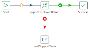
To fulfill this purpose, I create a job flow as below with one transformation and a mail step. The transformation takes on the major work needed to be done from extract through transform to load. The mail step sends an email to the support team when the process fails due to an unexpected error. 


The major part is the transformation which extracts data from [Employee] table and [Department] table, filters out invalid records, joins the two data sets and then loads the clean data into [EmployeeDetails] table.


Spoon provides a graphical interface where you can configure log setting. Double click [importEmployeeDetails] transformation on the job design window and the setting dialog pops up. Go to [Logging] tab and specify a log file as well as the preferable log level. 

Here is an example of the log with basic level for the above transformation.


With plenty of in-box functionalities, you can develop an ETL process in a stress-free way to import employee master data into your application. The process is visualized on Spoon and each of steps is visible to you during execution.

Pentaho Tips - How to Connect to Oracle EX 18c


Scenario

Java Tips - Use StringUtils to Compare Strings


Scenario

Pentaho Tips - How to Add a New Column to the Stream?


Scenario

Make Java to Handle Only Business Logics (1) - Introduction

Java is widely used for building business applications in enterprises scaled at all levels. The multi-layered architecture provides great flexibilities to integrate with other systems as well as excellent maintainability, and a handful of frameworks such as Spring, Struts, MyBatis, Hibernate, Spark and etc. equips it with powerful capacity to process large business computing. 

Spring-MVC plays an important role in building web applications which are dominant nowadays in an enterprise. This kind of applications serve a group of specific users and may work a dozen of years since moved to production. Modifications made to the system are in principle requirement based, in other words, if users want some new features, engineers build them according to the requirement provided, always with cost and time restrictions. Features out of scope, basically are not in consideration. The whole process looks perfect in the field.

On the other hand, this kind of applications are usually designed for some specific browser. When the browser retires, the application needs to be fully tested for the alternative one so that it will not malfunction. If an current feature is no longer supported by the new browser, it may cause modifications on the server-side program, and heavy testing work is ahead in various system environments. In nature, JSP pages are implemented on the server side and page navigation is embedded in the program. 

As user experience and usability are gaining more prominence today, what if we need to implement a different front end design but keep the same functionalities? What if we need to port it to smart phones and tablets with an aim to boost mobile office? The efforts would become enormous. 

Here we discuss another architecture that takes the views and view navigation out of the server and build them in React. In the meanwhile, make Java which handles business logics on the application server to be presented as REST APIs, which will be consumed by React. This will enable us to reuse the business logic part and to build fancier views with various styles on the front end.

Before we dive into it, we take a glimpse of the basic concept of Micro-Service architecture. Here is an example of fictitious e-commerce application which processes orders by shopping customers. The backend services are exposed as REST APIs.


Source: https://microservices.io/patterns/microservices.html

I borrow this on the hope of helping me illustrate the architecture we will try. If you would like to explore more about Microservice architecture, please reference the official documents.

The business case I chose for illustration is stated as follows. 

  •  User references clients' information for the day-in and  day-out operation. 
  •  Client data is imported into the application's database from the master database at daily base.
  •  User accesses the application through Internet.

To address the above business scenario, I will build a Spring batch to load client data scheduled at night, a Java REST API to retrieve the client data, and a React view to present the result to the end user, as shown in the below diagram.


How to build these components? I will discuss them in the subsequent posts.

    Make Java to Handle Only Business Logics (2) - Spring Boot Batch

    Make Java to Handle Only Business Logics (3) - REST API

    Make Java to Handle Only Business Logics (4) - How about Using an ETL Process in Place of Spring Boot Batch?


Oracle for Analytics - SQL Modeling

SQL modeling in Oracle provides a way to do calculations like a spreadsheet does. It leverages the data processing power of Oracle database engine and immediate access to the large data sets. With the calculation rules specified, SQL modeling is another sophisticated technique for data analysis and reporting.

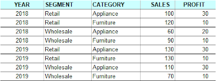
Let's work on a few samples together to get an overview of this technique. I created a view by the name of SALES_VIEW, which has 5 columns, YEAR, SEGMENT, CATEGORY, SALES and PROFIT. All the values for each column are displayed in the table below.


All models in this exercise will be built on this view. 


The Basics


We start with a model that sums up Sales in the last 2 year by category and assign the values to 2020 respectively. 
Here comes the SQL script.

SELECT
    SEGMENT
   ,CATEGORY
   ,YEAR
   ,S
FROM SALES_VIEW_TBL
MODEL
    RETURN ALL ROWS
    PARTITION BY (SEGMENT)
    DIMENSION BY (CATEGORY, YEAR)
    MEASURES (SALES S)
    UNIQUE DIMENSION
    RULES UPSERT SEQUENTIAL ORDER
    (
        S['Appliance', 2020] = S[CV(CATEGORY), 2019] + S[CV(CATEGORY), 2018],
        S['Furniture', 2020]  = S[CV(CATEGORY), 2019] + S[CV(CATEGORY), 2018]
    )
    ORDER BY
    SEGMENT
   ,CATEGORY
   ,YEAR
;

Below is the result we got. The records with gray background are newly generated by the model.


First of all, all the columns appearing in the model are categorized into 3 groups, partition, dimension and measure columns. 

  • Partition columns. They divide the data set into logical blocks, in other words, define the boundaries for calculations. The concept is similar with partitions in the analytic functions.

  • Dimension columns. They are attributes describe the measures. A full combination of them can  identify one cell in a partition. 

  • Measure columns. These columns have numeric values and similar to facts in a multi-dimensional fact table.
In a model, you'll need to explicitly specify the 3 groups of columns.

Second, RULES block gives the instructions for how to compute the measures in the model. You can use SQL functions including analytic ones, not to mention arithmetic operators. 

Third, a measure is reference by the dimensions. You can reference one measure as well as multiple measures. For example, S['Appliance', 2020] indicates one cell. CV function returns the current value of a dimension used in the left side of a computation formula. 

Additionally, you can also specify some general calculation rules. Here are some examples.

RETURN ALL ROWS: This returns all selected including updated rows by the rules. RETURN UPDATED ROWS will return only those updated rows. 

UNIQUE DIMENSION:  This says the combination of partition and dimension columns uniquely identify one cell.

SEQUENTIAL ORDER: This means the rules will be executed in the written order in the clause.


Rules for SQL Modeling


As you might have noticed in the previous section, you can apply rules in the Model clause to cell calculations, row handling, execution order and etc.

For cell reference, here are some basic rules. Please be noted that  the dimensions are the key to position a cell.

Single Cell Reference - Constants are used for dimensions, for example, S['Appliance', 2020].

Multi-Cell Reference - Here are the two examples for the left side and right side respectively, S['Appliance', YEAR >= 2018], MAX(S)['Appliance', Year BETWEEN 1998 AND 2002].

CV Function - It provides a means to use the dimension values on the right side which are referenced on the left side as illustrated in this formula, S['Appliance', 2020] = S[CV(CATEGORY), 2019] + S[CV(CATEGORY), 2018].


For determining cell behavior, you can use UPDATE, UPSERT, and UPSERT ALL. Here are some highlighted points.

UPDATE - If the referenced cell in the left side exists, its measure is updated with the calculation result. No new cells will not be inserted.

UPSERT -  If the cell exists, its measure will be updated. If it doesn't exist, a new cell will be inserted.

UPSERT ALL -  Simply put, it enables the model rules on the left side to have UPSERT capability. For example, S[ANY, 2020] = S[CV(), 2019] + S[CV(), 2018].


There are also some other general rules, for example,

  • Measures are the only updatable columns
  • In terms of execution order, all other clauses, except for Select Distinct and Order By, are evaluated before the Model clause

  • You can't use an aggregate or analytic function in either Select list or Order By list when you have a Model clause in your query

  • You can't use subqueries in the rules except in FOR loop
  • And etc.


Using Aggregate/Analytic Functions in SQL Modeling


To use aggregate or analytic functions in a model clause is straightforward. Basically you just follow the syntax of those functions, no magic here. Let's take a look at a couple of examples.

An Example of Using an Aggregate Function


SELECT
    SEGMENT
   ,CATEGORY
   ,YEAR
   ,S
FROM SALES_VIEW
WHERE YEAR = 2019
MODEL
    DIMENSION BY (SEGMENT, CATEGORY, YEAR)
    MEASURES (SALES S)
    RULES UPSERT
    (
        S['Retail', 'Sub-total', 2019]          = SUM(S)[CV(SEGMENT), ANY, 2019],
        S['Wholesale', 'Sub-total', 2019]  = SUM(S)[CV(SEGMENT), ANY, 2019],
        S['Total', '', 2019]                          = SUM(S)[ANY, 'Sub-total', 2019]
    )
    ORDER BY
    SEGMENT
   ,YEAR
   ,CATEGORY
;


An Example of Using an Analytic Function

  
SELECT
     YEAR
    ,SEGMENT
   ,CATEGORY
   ,S
   ,CSUM
FROM SALES_VIEW
MODEL
    PARTITION BY ( YEAR )
    DIMENSION BY ( SEGMENT, CATEGORY )
    MEASURES (SALES S, 0 CSUM )
    RULES UPSERT
    (
        CSUM[ANY, ANY] = SUM(S) OVER ( PARTITION BY YEAR
                                                                         ORDER BY         YEAR, SEGMENT, CATEGORY 
                                                                         ROWS UNBOUNDED PRECEDING )
    )
    ORDER BY
     YEAR
    ,SEGMENT
   ,CATEGORY
;


Parallel Execution


When you have a number of processors in your database server, parallel computation is expected to be an efficient way to improve performance. Model clause computation can leverage it if you have PARTITION BY keys in the model. Accordingly data will be partitioned among the parallel slaves.


Machine Learning - Train a Decision Tree

The credit goes to Dr. Michael Bowles, the author of Machine Learning in Python.

Mike illustrated how to train a decision tree in his book in such an easy-understanding way that I am excited to share it. Here I redo the examples step by step but use a slightly different data set. I also rewrote a part of the codes by replacing the loop calculations for arrays with Numpy functions.

In the model training, either of Sum Squared Error (SSE) or Mean Squared Error (MSE) is employed to measure the model's performance. Moreover, we change the 2 main variables as below to see how well it works:

  •     Depth of tree
  •     Size of training data

Train a Simple Decision Tree

import numpy as np
import matplotlib.pyplot as plot
from sklearn import tree
from sklearn.tree import DecisionTreeRegressor

def simpleTree():
#
# Generate a simple data set for the training
# x is between -0.5 and 0.5 incremented by 0.01
# y is equal to x + a random number generated by a gamma distribution
xPlot = np.round(list(np.arange(-0.5, 0.51, 0.01)), 2)

#
# x needs to be list of lists while using DecisionTreeRegressor
x = [[s] for s in xPlot]

#
# y has a gamma random added to x
np.random.seed(1)
y = xPlot + np.random.gamma(0.3, 0.1, len(xPlot))

#
# Decision tree with Depth = 1
simpleTree1 = DecisionTreeRegressor(max_depth=1)
simpleTree1.fit(x, y)

#
# Draw the tree. Use the following command to generate a png image
# dot -Tpng simpleTree1.dot - o simpleTree1.png
with open("simpleTree1.dot", 'w') as f:
f = tree.export_graphviz(simpleTree1, out_file=f)

#
# Compare predicted values by the tree against true values
yHat = simpleTree1.predict(x)

plot.subplot(221)
plot.plot(xPlot, y, label='true y')
plot.plot(xPlot, yHat, label='Tree Prediction', linestyle='--')
plot.legend(bbox_to_anchor=(1, 0.23))
plot.title('Depth = 1')
plot.axis('tight')
plot.xlabel('x')
plot.ylabel('y')

#
# Decision tree with Depth = 2
simpleTree2 = DecisionTreeRegressor(max_depth=2)
simpleTree2.fit(x, y)

#
# Draw the tree
with open("simpleTree2.dot", 'w') as f:
f = tree.export_graphviz(simpleTree2, out_file=f)

#
# Compare predicted values by the tree against true values
yHat = simpleTree2.predict(x)

plot.subplot(222)
plot.plot(xPlot, y, label='True y')
plot.plot(xPlot, yHat, label='Tree Prediction', linestyle='--')
plot.legend(bbox_to_anchor=(1, 0.2))
plot.title('Depth = 2')
plot.axis('tight')
plot.xlabel('x')
plot.ylabel('y')

#
# Split point calculations - try every possible split point to find the best one
# sse stands for sum squared errors
sse = []
xMin = []
mysse = []
for i in range(1, len(xPlot)):
#
# Divide list into points on left and right of split point
lhList = list(xPlot[0:i])
rhList = list(xPlot[i:len(xPlot)])

#
# Calculate sum squared errors on left and right
lhSse = np.var(lhList) * len(lhList)
rhSse = np.var(rhList) * len(rhList)

#
# Add sum of left and right to the error list
sse.append(lhSse + rhSse)
xMin.append(max(lhList))

minSse = min(sse)
idxMin = sse.index(minSse)
print(f'Index: {idxMin} min x:{xMin[idxMin]}')
print(sse)

plot.subplot(223)
plot.plot(range(1, len(xPlot)), sse)
plot.xlabel('Split Point Index')
plot.ylabel('Sum Squared Error')
plot.title('SSE vs Split Point Location')

#
# Decision tree with Depth = 6
simpleTree6 = DecisionTreeRegressor(max_depth=6)
simpleTree6.fit(x, y)

#
# More than 100 nodes were generated
# Among them were 50 leaf nodes
with open("simpleTree6.dot", 'w') as f:
f = tree.export_graphviz(simpleTree6, out_file=f)

#
# Compare predicted values by the tree against true values
yHat = simpleTree6.predict(x)

plot.subplot(224)
plot.plot(xPlot, y, label='True y')
plot.plot(xPlot, yHat, label='Tree Prediction', linestyle='--')
plot.legend(bbox_to_anchor=(1, 0.2))
plot.title('Depth = 6')
plot.axis('tight')
plot.xlabel('x')
plot.ylabel('y')

plot.show()

Binary Decision Tree with Depth = 1


Binary Decision Tree with Depth = 2


Comparisons


Use Cross-validation to Find the Decent Depth with Best Performance

When you increase the depth of tree, you may achieve a better performance. However, it doesn't mean a larger depth, a better performance. You will need to avoid overfitting as demonstrated by the example below. Be noted that important variables are split near the top of the tree in binary decision trees.

import numpy as np
import matplotlib.pyplot as plot
from sklearn.tree import DecisionTreeRegressor

def simpleTreeCV():
#
# Generate a simple data set for the training
# x is between -0.5 and 0.5 incremented by 0.01
# y is equal to x + a random number generated by a gamma distribution
xPlot = np.round(list(np.arange(-0.5, 0.51, 0.01)), 2)

#
# x needs to be list of lists while using DecisionTreeRegressor
x = [[s] for s in xPlot]

#
# y has a gamma random added to x
np.random.seed(1)
y = xPlot + np.random.gamma(0.3, 0.1, len(xPlot))

#
# Fit trees with the depth increased from 1 to 7 step by step
# and determine which performs best using x-validation
depthList = [1, 2, 3, 4, 5, 6, 7]
xvalMSE = []
nxval = 10
nrow = len(x)

for iDepth in depthList:

oosErrors = 0
#
# Build cross validation loop to fit tree and
# evaluate on the test data set
for ixval in range(nxval):
#
# Prepare test and training data sets
idxTest = [a for a in range(nrow) if a%nxval == ixval%nxval]
idxTrain = [a for a in range(nrow) if a%nxval != ixval%nxval]

xTrain = [x[r] for r in idxTrain]
yTrain = [y[r] for r in idxTrain]
xTest = [x[r] for r in idxTest]
yTest = [y[r] for r in idxTest]

#
# Train tree of appropriate depth and find the differences
# between the predicted output and the true output
treeModel = DecisionTreeRegressor(max_depth=iDepth)
treeModel.fit(xTrain, yTrain)

treePrediction = treeModel.predict(xTest)
error = np.subtract(yTest, treePrediction)
#
# Accumulate squared errors
oosErrors += sum(np.square(error))
#
# Average the squared errors and accumulate by tree depth
mse = oosErrors / nrow
xvalMSE.append(mse)

#
# Show how the averaged squared errors vary against tree depth
plot.plot(depthList, xvalMSE)
plot.axis('tight')
plot.xlabel('Tree Depth')
plot.ylabel('Mean Squared Error')
plot.title('Balancing Binary Tree Complexity for Best Performance')
plot.show()


Oracle for Analytics - Pivot and Unpivot

 Pivoting is a very useful technique in data analytics, which transforms rows into columns. On the contrary, unpivoting operation brings columns to rows. If you are familiar with pivot table in Excel, you can simply see this as a implementation at database level. Tableau also incorporates this technique into its data source layer.

Pivoting works as shown by the diagram below.


I am going to demonstrate them in the following sections by using the below data example, a view named by SALES_VIEW. 


Oracle for Analytics - Materialized View


1 Introduction


In data warehousing environment, performance is an eye-catching theme as always. Materialized view provides an efficient and effective means to improve performance. It enables a mechanism to precompute summaries or expensive joins and store the results. Materialized view can be used for 
improving query performance as well as providing replicated data.

Generally, there are 3 types of materialized view:
  • Materialized View with Aggregates
  • Materialized View Containing Only Joins
  • Nested Materialized Views
We'll create them one by one in the below sections.


2 How to Create a Materialized View?


In this demonstration, I use table OFA_ORDERS to keep measures, along with the other 3 dimensional tables such as OFA_CUSTOMERS, OFA_RETURNS and OFA_PRODUCTS. The model is shown as the diagram below.


ER Diagram

A materialized view is created by using CREATE MATERIALIZED VIEW statementLet's create 3 types of materialized views one by one.

2-1 Create Materialized View Logs


Materialized view logs are not mandatory. However, if you want to use fast refresh, you will need to create materialized view logs. In case the detail table supports partition change tracking (PCT), the log on that table is not required. 
The materialized view log creation statements used in this exercise are as follows.

CREATE MATERIALIZED VIEW LOG ON OFA_ORDERS WITH ROWID (ORDER_ID, ORDER_DATE, SHIP_DATE, SHIP_MODE, CUSTOMER_ID, PRODUCT_ID, SALES, QUANTITY, DISCOUNT, PROFIT) INCLUDING NEW VALUES;

 CREATE MATERIALIZED VIEW LOG ON OFA_PRODUCTS WITH ROWID (PRODUCT_ID, CATEGORY, SUB_CATEGORY, PRODUCT_NAME) INCLUDING NEW VALUES;

 CREATE MATERIALIZED VIEW LOG ON OFA_CUSTOMERS WITH ROWID (CUSTOMER_ID, CUSTOMER_NAME, SEGMENT, COUNTRY_REGION, CITY, STATE, REGION, POSTAL_CODE) INCLUDING NEW VALUES ;

CREATE MATERIALIZED VIEW LOG ON OFA_RETURNS WITH ROWID (ORDER_ID, RETURNED) INCLUDING NEW VALUES ;


2-2 Materialized View with Aggregates


The first example is to create a summary materialized view with a column alias list added to the CREATE statement.

CREATE MATERIALIZED VIEW MV_SALES_PRODUCT
(ORDER_DATE, PRODUCT_ID, CATEGORY, SUB_CATEGORY, PRODUCT_NAME, SUM_SALES, SUM_QUANTITY, SUM_PROFIT)
PARALLEL
BUILD IMMEDIATE
REFRESH FAST ON COMMIT
ENABLE QUERY REWRITE
AS
SELECT
    ORDER_DATE
   ,ORD.PRODUCT_ID
   ,CATEGORY
   ,SUB_CATEGORY
   ,PRODUCT_NAME
   ,SUM(SALES)
   ,SUM(QUANTITY)
   ,SUM(PROFIT)
FROM
OFA_ORDERS ORD
LEFT JOIN 
OFA_PRODUCTS PRD
    ON ORD.PRODUCT_ID = PRD.PRODUCT_ID
GROUP BY
    ORDER_DATE
   ,ORD.PRODUCT_ID
   ,CATEGORY
   ,SUB_CATEGORY
   ,PRODUCT_NAME
;

2-3 Materialized View Containing Only Joins


When JOINs become very expensive, you can create a materialized view precalculating the joins as a solution, as shown by the following example. Then build queries and aggregate calculations upon the materialized view.
 
CREATE MATERIALIZED VIEW MV_SALES_JOIN
PARALLEL
BUILD IMMEDIATE
REFRESH FORCE
ENABLE QUERY REWRITE
AS
SELECT
    ORD.ORDER_ID
   ,ORDER_DATE
   ,SHIP_DATE
   ,SHIP_MODE
   ,ORD.CUSTOMER_ID
   ,ORD.PRODUCT_ID
   ,SALES
   ,QUANTITY
   ,DISCOUNT
   ,PROFIT
   ,CATEGORY
   ,SUB_CATEGORY
   ,PRODUCT_NAME
   ,CUSTOMER_NAME
   ,SEGMENT
   ,COUNTRY_REGION
   ,CITY
   ,STATE
   ,CTM.REGION
   ,POSTAL_CODE
   ,RETURNED
FROM
OFA_ORDERS ORD
LEFT JOIN 
OFA_PRODUCTS PRD
    ON ORD.PRODUCT_ID = PRD.PRODUCT_ID
LEFT JOIN 
OFA_CUSTOMERS CTM
    ON ORD.CUSTOMER_ID = CTM.CUSTOMER_ID
LEFT JOIN 
OFA_RETURNS RET
    ON ORD.ORDER_ID = RET.ORDER_ID
;

2-4 Nested Materialized View


The below view, MV_SALES_ANALYTICS, is built on the join materialized view created in the above section, with a column alias assigned to each field.

CREATE MATERIALIZED VIEW MV_SALES_ANALYTICS
PARALLEL
BUILD IMMEDIATE
REFRESH COMPLETE
ENABLE QUERY REWRITE
AS
SELECT
    TO_CHAR(ORDER_DATE, 'YYYYMM')  ORDER_YM
   ,CATEGORY                                                  CATEGORY
   ,SUB_CATEGORY                                        SUB_CATEGORY
   ,SEGMENT                                                    SEGMENT
   ,COUNTRY_REGION                                  COUNTRY_REGION
   ,CITY                                                             CITY
   ,STATE                                                           STATE 
   ,REGION                                                       REGION
   ,SUM(SALES)                                               SUM_SALES
   ,SUM(QUANTITY)                                      SUM_QUANTITY
   ,SUM(PROFIT)                                             SUM_PROFIT
FROM
MV_SALES_JOIN
GROUP BY
    TO_CHAR(ORDER_DATE, 'YYYYMM')
   ,CATEGORY
   ,SUB_CATEGORY
   ,SEGMENT
   ,COUNTRY_REGION
   ,CITY
   ,STATE
   ,REGION
;

Using the above materialized view, we can carry out further analytic tasks. For example, we may want to compare a city's monthly profit with the top in that month.

SELECT
   ORDER_YM
  ,STATE
  ,CITY
  ,SUM(SUM_SALES) TOTAL_SALES
  ,SUM(SUM_PROFIT) TOTAL_PROFIT
  ,SUM(SUM_PROFIT) / SUM(SUM_SALES) PROFIT_RATIO
  ,NTH_VALUE(SUM(SUM_PROFIT), 1) OVER 
  (PARTITION BY ORDER_YM ORDER BY SUM(SUM_PROFIT) DESC 
  ROWS BETWEEN UNBOUNDED PRECEDING AND UNBOUNDED FOLLOWING) TOPPROFIT_YM
FROM
MV_SALES_ANALYTICS
GROUP BY
   ORDER_YM
  ,STATE
  ,CITY
ORDER BY
   ORDER_YM
  ,STATE
  ,CITY
;


3 Partitioned Materialized View


In data warehousing context, partitioning is a significant technique. Partitioning fact tables can provide you with many benefits in terms of scalability, administration, performance and etc. You can partition a materialized view as well.

CREATE MATERIALIZED VIEW MV_SALES_PRODUCT_PARTITIONED
(ORDER_DATE, PRODUCT_ID, CATEGORY, SUB_CATEGORY, PRODUCT_NAME, SUM_SALES, SUM_QUANTITY, SUM_PROFIT)
PARALLEL
PARTITION BY RANGE (ORDER_DATE) INTERVAL (NUMTOYMINTERVAL(1, 'YEAR'))
(PARTITION "P2014"  VALUES LESS THAN (TO_DATE('2015-01-01 00:00:00', 'YYYY-MM-DD HH24:MI:SS')),
PARTITION "P2015"  VALUES LESS THAN (TO_DATE('2016-01-01 00:00:00', 'YYYY-MM-DD HH24:MI:SS')))
BUILD IMMEDIATE
REFRESH FAST
ENABLE QUERY REWRITE
AS
SELECT
    ORDER_DATE
   ,ORD.PRODUCT_ID
   ,CATEGORY
   ,SUB_CATEGORY
   ,PRODUCT_NAME
   ,SUM(SALES)
   ,SUM(QUANTITY)
   ,SUM(PROFIT)
FROM
OFA_ORDERS ORD
LEFT JOIN 
OFA_PRODUCTS PRD
    ON ORD.PRODUCT_ID = PRD.PRODUCT_ID
GROUP BY
    ORDER_DATE
   ,ORD.PRODUCT_ID
   ,CATEGORY
   ,SUB_CATEGORY
   ,PRODUCT_NAME
;


4 Refresh Materialized View


There are 3 packages available for refreshing materialized view.
  • DBMS_MVIEW.FEFRESH - Refresh one or more materialized view.
  • DBMS_MVIEW.FEFRESH_ALL_MVIEWS - Refresh all materialized views.
  • DBMS_MVIEW.FEFRESH_DEPENDENT - Refresh all materialized views relying on the specified tables or materialized views.
For example, we can use this statement to refresh MV_SALES_JOIN materialized view created in Section 2-3.
EXEC DBMS_MVIEW.REFRESH('MV_SALES_JOIN', METHOD => 'C');

Additionally, atomic refresh option ensures the views refreshed as a whole in a single transaction. For example, the all views will be refreshed in a single transaction if atomic refresh is enabled in DBMS_MVIEW.FEFRESH_ALL_MVIEWS.


5 A Note about Compression


If a materialized view is not build on a prebuilt table, it consumes storage space for sure. The table below suggests how much storage space our materialized views take up. You can consider compression technique as an option to save space especially when your data is redundant.


Machine Learning - Draw Basic Graphs with Matplotlib

 Matplotlib is a comprehensive visualization library in Python. It was originated by John Hunter. As an open source software, it is utilized by thousands of researchers and engineers.

In machine learning domain, Matplotlib is also used as an effective tool to draw a variety of graphs such as bars, line, scatter, pie chart, box plot and etc. Here we use it draw several common graphs. 

1. Line

A circle marker is added on each point and the line color is set 'Blue'.

import matplotlib.pyplot as plt
from numpy import randomx = random.randint(100, size=(30))
x = random.randint(100, size=(30))
x.sort()
y = [i + random.normal(loc=20, scale=10) for i in x]

plt.plot(x, y, label="random data", linestyle='solid', color='blue', marker="o")
plt.legend()
plt.title("Line Graph")
plt.show()

2. Bars

Horizontal bar graph can be plotted using barh() function. Surely you can move the legend around in the visualization.

import matplotlib.pyplot as plt
from numpy import random
x = ('Dim A', 'Dim B', 'Dim C', 'Dim D', 'Dim E')
y = random.random(5)
plt.subplot(121)
plt.bar(x, y, label="random data")
plt.legend(bbox_to_anchor=(0, 1), loc='upper left', borderaxespad=0, fontsize=9)
plt.title("Vertical Bar Graph")

plt.subplot(122)
plt.barh(x, y, label="random data")
plt.title("Horizontal Bar Graph")
plt.show()


3. Pie Chart

Pie chart is useful when you want to display proportions of data.

x = ('Dim A', 'Dim B', 'Dim C', 'Dim D', 'Dim E')
y = random.random(5)
plt.pie(y, labels=x)
plt.legend(bbox_to_anchor=(1.2, 1), loc='upper right', borderaxespad=0, fontsize=9)
plt.title("Pie Chart")
plt.show()


4. Scatter

Use the same data sets created for the line graph as shown above.

plt.scatter(x, y, color="hotpink", label="random data")
plt.legend()
plt.title("Scatter Graph")
plt.show()


5. Histograms

Histogram shows the distribution of data.

x = random.binomial(100, 0.5, 300)
plt.hist(x, label='binomial')
plt.legend()
plt.title("Histograms")
plt.show()

6. Box Plot

Box plot illustrates the distribution of data as well as the skewness based on 5 number summary which are minimum, 1st quartile, median, 3rd quantile and maximum.

data = random.normal(loc=random.randint(20), scale=30, size=(1500, 3))
plt.title('Box Plot')
plt.xlabel('Dimension')
plt.ylabel('Measure')
plt.boxplot(data)
plt.show()


7. Probability Plot

Let's also have a look at a simple probability plot example here. A probability plot compares the probabilities of the sample data against a theoretical distribution specified by "stat=" parameter, which is the normal distribution if not specified. 

The points form a straight line if the 2 sets come from the same distribution.
import matplotlib.pyplot as plt
from scipy import stats

x = stats.norm.rvs(loc=25, scale=2, size=30)
res = stats.probplot(x, plot=plt)
ymin, ymax = 19, 31
plt.ylim(ymin, ymax)
plt.show()


React - Makeover in React: W3Schools How To

When it comes to building a React app, I get used to searching for a UI library to build the front pages, a straightforward way to achieve f...